Himnadi हिमनदी
A public register of the ice above Pokhara
A fictional institute in Pokhara keeping the public ledger of the ice that feeds the city's rivers — and, once in a generation, destroys part of it. The institute is invented. The glaciers, the measurements, and the flood are not.
- Role
- Concept · Art direction · Data pipeline · WebGL engineering · Editorial design
- Stack
- Next.js 16 · React 19 · React Three Fiber · postprocessing · GSAP + Lenis · Tailwind v4 + CSS Modules · Theatre.js · Playwright
- Year
- 2026
- Discipline
- Data Editorial · WebGL
The ice above the city, on the record
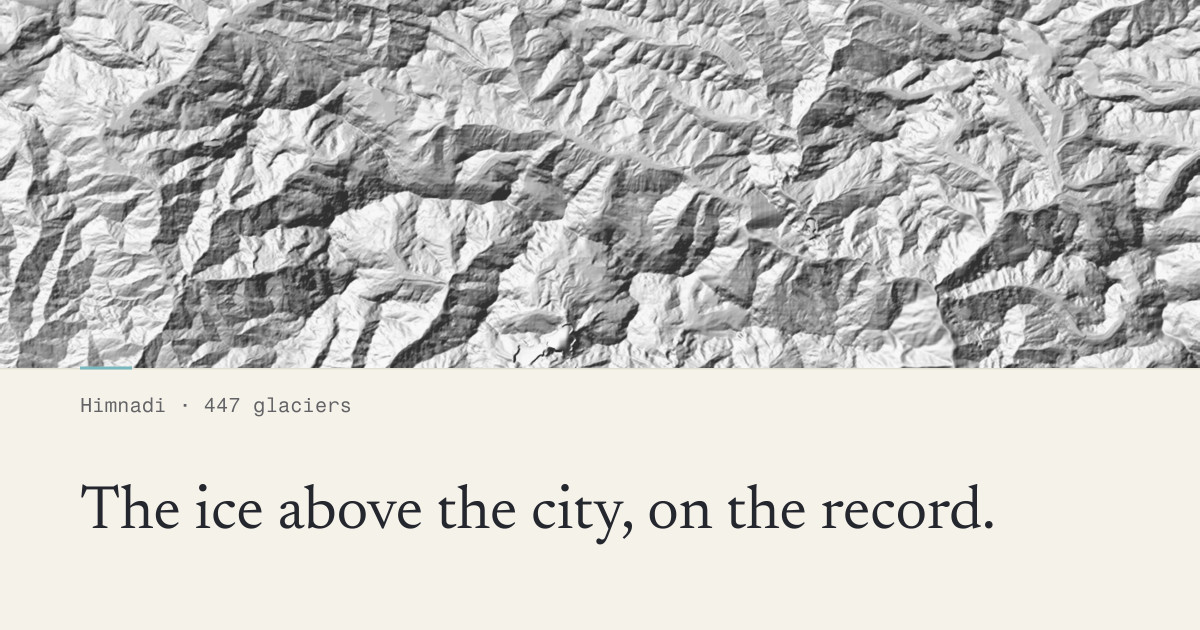
Himnadī (हिमनदी) is Nepali for glacier — literally snow-river. Himnadi is the site of a fictional scientific institute that maintains the public register of every glacier in the Gandaki basin: the inventory, the dangerous lakes, and the record of 5 May 2012, when the Seti river rose without rain and killed seventy-two people. In the fiction, the institute was founded that year, and its charter is that nobody below the mountain should be surprised again.
The strategic case for the concept was that it cannot be transplanted. Any studio anywhere can build a watch brand or a fashion archive. Nobody in London or Montreal can credibly publish the register of the ice above their own city. Building it from Pokhara is the entire point.
Real data, so the content is real
Content is the most-faked part of every concept site. Himnadi does not have any lorem ipsum in it, because every number on the page is a measurement. The glacier inventory comes from ICIMOD's open Regional Database System — Landsat-derived extents for 1990, 2000, 2010 and 2020, mapped at 1:50,000 — and the terrain engine is built from Copernicus DEM tiles covering the basin.
The register reads like a field ledger rather than a marketing site. Declarative, measured, unsentimental; the numbers do the mourning. A typical entry: unnamed, 5,910 m, first mapped 1990 at 1.42 km², last mapped 2020 at 0.87 km² — thirty-nine percent lost in one working lifetime.
The footer says plainly that the institute is fictional and that the glaciers, the numbers, and the flood are real. That single sentence turns a fake-client concept into a designed publication about real data.
Paper-first, against the dark-WebGL default
Almost every WebGL portfolio piece is dark. Himnadi is deliberately the opposite: snow and paper want light, and light-mode restraint is harder to fake. Darkness is reserved and spent exactly once, on a single route.
The palette is four decisions in OKLCH and no gradients anywhere. Unbleached survey paper, never pure white. Cold ink — black with a degree of frost in it. Rock-flour turquoise, taken from the region's own colour story: glaciers grind stone into flour, the flour turns the lakes turquoise and the Seti milk-white. And a marker red-orange spent only on danger data — flagged lakes, risk classifications, the 2012 chapter. If it is red, it can kill you. That is the whole system.
One layout primitive, repeated with discipline
Everything on the site is a survey instrument reading a landscape. A single primitive — the register row — repeats across the basin map, the glacier register, the lake inventory, and the 2012 chapter, with an editorial serif carrying the prose and a characterful mono carrying every reading, ID and coordinate in tabular figures.
The WebGL is the subject matter rather than decoration: a relief-shaded terrain engine that morphs thirty years of ice extent across the basin. There is no blob to delete — remove the shader and you remove the argument.
444 of 447 have no name
447 glaciers stand in the Gandaki survey window above Pokhara. Exactly three carry a name — Baibubu, Rikha Samba, and Jialakang. The other 444 are known only by number, and the register keeps them on the record anyway. The count is asserted at build time from the source data, so the headline cannot drift away from the dataset it describes.
A case study is a summary. The site is the argument.
Himnadi is live — go and use it, then tell us what you want built.