SaaS UX Design: Why It Is Different, and the Screens Nobody Demos
Every guide to SaaS UX lists principles. This one lists screens. The demo screen gets designed in every product; the product is used on day 30 through screens that never make the deck, and that is where SaaS design is won or lost.
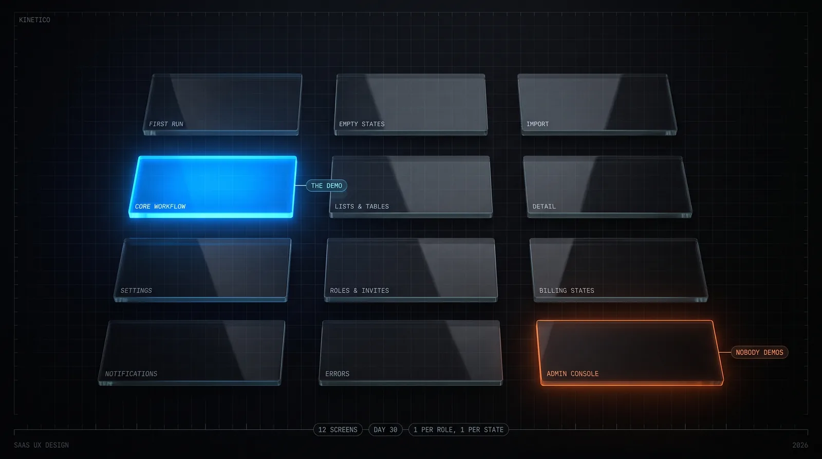
SaaS UX design is different because the buyer is not the user, the product launches empty, people return daily, and every screen exists once per role and once per state. The work is twelve screens, not one: first run, empty states, import, the core workflow, lists, detail, settings, roles, billing states, notifications, errors and the admin console. Kinetico, a product design and engineering studio, designs all twelve inside a $15k–$50k fixed build.
We design and build SaaS, so this is written from the side that has to make every one of those screens work. Two of the products we have shipped are the examples: a payments platform with a merchant dashboard and a regulator-grade admin console, and a booking system whose admin console is used by door staff on a busy night. The ranking guides (Userpilot, UX Army, Fuselab, Toptal) are quoted where they say something specific. This guide sits in the design branch of our library, next to fintech UX design, and the work it describes is what our product design service is engaged to do.
Key Takeaways
- •A SaaS product launches empty. The first screen every new user sees is an empty state, so empty states are where onboarding happens, not a polish task at the end.
- •Every screen exists once per role and once per state. Fourteen screens with three roles and four states is closer to fifty designed surfaces, which is why roles are the biggest driver of a build's price and why the second role should often be a shared view in v1.
- •Design the twelve screens, not the one. Settings, invites, past-due billing, error recovery and the admin console are used more on day 30 than the dashboard is, and they are the screens that get skipped.
- •Onboarding has one goal: the user's own data in the product and the core workflow run once on it. Import beats connect beats template beats tour. UX Army, citing Amplitude, puts the cost of missing early value at 91% of new users gone within 14 days.
- •Design is 20 – 25% of a Kinetico fixed build, roughly $3,000–$12,500 on the published $15k–$50k band (our arithmetic), delivered as every screen in every state plus a coded design system in your repository, 1–2 weeks ahead of the engineers who are the same people.
What makes SaaS UX design different from website or consumer app design?
Most SaaS founders have shipped a website, and many have used a consumer app enough to have opinions. Neither prepares you for the eight things below, and every one of them adds screens.
| Dimension | Website or consumer app | SaaS |
|---|---|---|
| Who buys, who uses | The visitor decides and leaves | A manager buys, a team uses, an admin configures. Three audiences, and the admin is a user with screens of their own |
| First screen | The best screen you have | An empty one. The product launches with no data, so the first thing every new user sees is an empty state |
| Visit pattern | Once, briefly | Daily, for hours. Density, keyboard speed and remembered state earn their keep; whitespace and hero imagery do not |
| Where the data comes from | Nowhere; the page is the content | A spreadsheet, another tool, an API. Import is a screen, and usually the hardest one |
| How many of each screen | One | One per role, times one per state (empty, loading, error, edge). Fourteen screens is closer to fifty designed states |
| Money | A checkout, if any | Trial, active, past due, cancelled, upgraded. Each is interface the user sees, not a flag in the database |
| Screens nobody demos | None | The internal admin console the company runs the product from. On a payments platform it is most of the engineering weight |
| Rate of change | A redesign every few years | Weekly releases. A design system that lives only in Figma is out of date within a month |
Row five is the one that decides budgets. On our published tiers, one role with 6–10 screens is a 6-week Lean build and three roles with 20–30 screens is a 10 – 12-week Full build, and the multiplier between them is mostly roles and states, not features. It is also why the pricing page lists user roles as the biggest single driver of the number. When a founder asks us to make a build cheaper, the first question is whether the second role could read a shared view or a spreadsheet in v1. It usually can.
The ranking guides describe the same territory in principles. UX Army lists five, including design for multiple user roles and clear feedback loops. Mouseflow leads with familiarity, the point that users punish interfaces that move things they had learned. Toptal starts with simplifying registration. All true. But a principle does not tell you which screens to design, and a screen list does, so that is what the next section is.
Which screens does a SaaS product need designed, and which get skipped?
Twelve, in the order a user meets them. The third column is what we see when a product arrives for a second version and only the first four were ever designed.
| Screen | Its job on day 30 | What happens when it is skipped |
|---|---|---|
| Sign-up and first run | Get one real thing done in the first session | A tour of features and an empty dashboard; the user leaves before entering data |
| Empty states | Teach the screen and offer the single action that fills it | A blank table with no hint of what belongs there. This is the screen most new users see most |
| Import and connect | Bring existing data in from the spreadsheet or tool being replaced | Manual re-entry, or a CSV upload that fails on the first real file |
| The core workflow | The thing they pay for, end to end, with real data | Rarely skipped. Usually the only screen that gets designed |
| List and table views | Find, sort, filter, select, act on many records | A card grid that works with 12 records and collapses at 1,200 |
| Detail view | Everything about one record, its history, its next action | A modal that cannot be linked to, printed or returned to |
| Settings | Workspace, profile, notifications, integrations, data export | Settings scattered across the app, and no way to leave with your data |
| Members, roles and invites | Add people, decide what each can see and do, remove them | Everyone is an admin, or the second role is a copy of the first with buttons hidden |
| Billing and plan states | Start a trial, pay, change plan, fail a payment, cancel, come back | Past due looks identical to active until the account is locked |
| Notifications | Tell the right role the right thing at the right moment, and let them turn it off | Everything emails everyone; users create a filter rule and never see the important one |
| Error and recovery | Say what failed, what is safe to retry, and who to contact | "Something went wrong" over a form the user has now lost |
| The admin console | Support, refunds, impersonation, audit, cross-tenant search | Support tickets answered by engineers running SQL in production |
The list maps onto the nine feature layers in our guide to SaaS MVP development, which says which of them to build and which to buy. This one is about the screens each layer needs, whoever supplies the code behind them. A managed auth provider still needs a sign-up screen you designed; Stripe still needs a past-due state you designed.
A note on the last row. On the payments platform, most of the engineering weight sits in the admin console, where operators need cross-tenant visibility over every merchant, wallet and ledger entry. That console had to be designed so an operator cannot move money or read personal data without the action being authorised, re-authenticated and permanently recorded. Nobody outside the company will ever see it. It has more designed states than the merchant dashboard.
How do you design SaaS onboarding that reaches first value?
Aim the first session at one outcome: the user's own data in the product, and the core workflow run once on it. Everything else in onboarding is in service of that, and most of what ships as onboarding works against it. A product tour is a delay before the data. A feature checklist is a to-do list for the user before they have seen why. An empty dashboard with sample charts is a promise about someone else's data.
Order the ways in by how fast they reach real data. Import from the tool being replaced comes first, because the spreadsheet already contains the user's entire mental model and a CSV upload that works on the first real file is the strongest onboarding a B2B product can have. Connecting an integration is second. A template with sample data is third, and it should be clearly labelled as sample and one click from deletion. A tour is last, and it should point at the user's data, not at the chrome.
Userpilot's 2026 guide names the shift as inference-based onboarding, the product working out what the user is trying to do from what they entered rather than asking them to pick a path, and describes empty states as demonstrations. That matches what we see. The empty state is the onboarding screen. It has one job: say what belongs here, and offer the one action that puts it there. If the action is an import, the empty state is the import screen. UX Army, citing Amplitude, gives the stakes as 91% of new users abandoning within 14 days if they do not reach early value, and Toptal's first two practices (simplify registration, then use onboarding to clarify function) are the same idea from the other end: nothing should stand between sign-up and the first real record.
The onboarding row in our tier scopes is deliberately small: a first-run flow that reaches first value in one session, and empty states that teach. Tours, checklists and lifecycle email are v2. They are worth building once you know what first value is, and you only learn that from watching people import.
How do you design for density: lists, tables and dashboards?
A SaaS product is used for hours a day by people who know it. That reverses the rules a website designer learned. Whitespace that reads as calm on a landing page reads as scrolling in a table that someone works in all afternoon. The unit of design is the row, and the questions are how many rows fit, how fast the eye finds the one that changed, and how few clicks it takes to act on it.
Design the list view before the dashboard. A dashboard summarises records; if the list and detail views are weak, the dashboard is a chart over data nobody can reach. Then design the table as a set of behaviours rather than a picture: sort on any column, filter that persists, bulk select, an inline action on the row, a detail view that opens without losing the list, and a URL for every filtered state so a link in a chat message opens the same view. On the payments platform, IDs are prefixed and sortable so an operator can read a type and an order at a glance in a log, and every money amount formats from integer paisa so the table never shows a rounding artefact. Those are design decisions that were made in the data model, which is only possible when the same people own both.
Dashboards are their own subject, and we have written about the financial kind in fintech UX design: the short version is that a dashboard answers a question, and a chart that does not change a decision is decoration. A small r/UXDesign thread on information-heavy SaaS with complex workflows (9 comments, so a data point rather than a study) gets the same place from a different direction. Its most useful reply says to design around workflows rather than pages. A table is not a page; it is where the workflow starts.
How do you design roles, permissions and the admin console?
Start from what each role must never be able to do. That sentence removes more screens and more bugs than any feature list adds. "A guide must not see customer payment details" is a permission, a hidden column and an absent screen, decided at once. Then give each role its own first screen, because a role that lands on another role's dashboard with half the buttons removed is the most common way the second role gets designed, and the users of that role can tell.
The admin console is the role nobody demos, and it is where the most careful design goes. On the payments platform it enforces separation of duties between compliance, support and finance-ops roles; every action that moves money needs a second person to approve it; sensitive operations demand re-authentication with a time-based code; and the audit trail records reads of personal data, not only writes. KYC limits are enforced at the API rather than in the interface, so a console screen cannot be the thing standing between a wallet and its cap. Each of those is a screen or a state that had to be designed, and none of them appears in a sales deck.
The booking system's console is the opposite size and the same discipline. It is used by door staff under pressure: pull up the booking by its verification code, check the party in, mark it verified with a timestamp. Ticket-only parties are verified guest by guest with the history kept, so a group arriving in twos over an hour never loses count. The same console runs the venue day to day, including events, the table inventory, the gallery and the promo popup, without a deploy. The design brief for an admin console is always the same question: what does the person using it need to do in the ten seconds they have, and what must they be unable to do by accident.
How do you design billing and plan states?
Billing is usually bought, and rightly so. Stripe or its equivalents handle the rail. What cannot be bought is what the user sees in each state, and a product where past due looks identical to active until the account is locked has skipped five screens.
| State | What the user sees | What must still work |
|---|---|---|
| Trial | Days remaining, what happens at the end, one route to paying | The whole product, with the limits visible before they are hit |
| Active | Plan, usage against limits, next invoice date, receipts | Everything on the plan; upgrade prompts only where a limit is near |
| Past due | A visible, dismissable notice with the exact failure and a fix-payment action | Read access at least; nothing destructive; a grace period stated in days |
| Cancelled | When access ends, what happens to the data, how to export it, how to come back | Export, and a reactivation that restores the workspace as it was |
| Changed plan | The proration, the effective date, what was gained or lost | Entitlements switch on the effective date, not on the button press |
Two rules from building it. Entitlements switch on the effective date, never on the button press, or a downgrade deletes a team's access mid-month and a refund conversation follows. And a cancelled account keeps export working, because the user who can leave with their data is the one who comes back. Userpilot names dark patterns in this area as a reputational risk in 2026; the cheaper observation is that a cancellation flow that hides the button is designed for the metric of the week and paid for in the reviews of the year.
Why should a SaaS design system live in the repository, not only in Figma?
Because the product ships weekly and the Figma file does not. A design system that exists only as a library of components in a design tool is a description of the product as of the last time someone synced it, and in a SaaS team that shipped four releases last month, that was a month ago. The system that matters is the one the code renders: tokens for colour, type, spacing and motion; typed components with their states built in; and a rule that a screen is done when it renders empty, loading, error and full from the same component.
This is the practical reason we hand over a coded design system in the repository rather than a Figma file alone, and it is the whole argument of our product design service: the designers are the engineers, so the design system is the component library, and there is no handoff in which the empty state gets lost. Fuselab's guide makes the related point that role-based dashboards became baseline in 2026 rather than an enterprise feature; that is only sustainable when a role is a property of components, not a second Figma file.
How much does SaaS UX design cost, and how long does it take?
Inside a Kinetico fixed-price build, product design is 20 – 25% of the number. On the published $15,000–$50,000 band, that is roughly $3,000–$12,500 depending on tier, our arithmetic on the published split, not a separate price list:
| Tier | Scope | Fixed price | Weeks | Design share at 20–25% |
|---|---|---|---|---|
| Lean | 1 user role · 6–10 screens · auth + one core workflow · 0–1 integration | $15k – $22k | 6 | $3,000 – $5,500 |
| Standard | 2 roles · 12–20 screens · core workflow + admin · payments or 2 integrations | $22k – $35k | 8 | $4,400 – $8,750 |
| Full | 3 roles · 20–30 screens · billing, notifications, reporting · 3+ integrations | $35k – $50k | 10 – 12 | $7,000 – $12,500 |
Design runs 1–2 weeks ahead of engineering inside the same calendar, so the design column of the published 8-week Standard plan is the schedule:
| Week | Design | Engineering |
|---|---|---|
| Week 1 | Scope locked; data model; core flows | Repo, CI, auth, database |
| Week 2 | Role-one screens, all states | Core object CRUD; first deployed demo |
| Week 3 | Role-two / admin screens | Core workflow end to end |
| Week 4 | Payments and settings screens | Admin, roles and permissions |
| Week 5 | Empty, error and edge states | Payments or integrations wired |
| Week 6 | Design QA against the build | Notifications, settings, polish |
| Week 7 | Handover files, design system docs | QA, performance, monitoring |
| Week 8 | — | Production deploy, docs, handover |
For comparison, Fuselab Creative quotes $40,000–$200,000 and 12–20 weeks from kickoff to engineering-ready specifications for a focused SaaS redesign as a standalone design engagement. DOOR3 describes a three-phase process of pre-design, UX development and UI refinement. Both are honest descriptions of design as a deliverable handed to engineers. The difference in our number is not that design is cheaper here; it is that the specification phase disappears when the person drawing the screen is the person who builds it next week, and the states that would have been lost in the handoff are designed once. Details on the pricing page.
What does SaaS UX design look like with Kinetico?
One 30-minute scoping call, then a written scope of modules, screens, states and integrations with a fixed price within 5 working days. Design starts in week 1 with the data model and the core flows, because the table and the detail view are decided by the data model. Every screen is designed in every state, for every role, by the people who build it a week later, and the design system is delivered as typed components in your repository with the tokens and documentation alongside. The twelve screens above are the checklist we work from; the tier decides how many roles and integrations each one has to serve. The service page covers deliverables, the three shapes of work and the FAQ; the brief we ask for is one page.
Frequently asked questions
What is SaaS UX design?
SaaS UX design is the design of a subscription software product that people sign into repeatedly to do work: the first-run and onboarding flow, the core workflow, the list and detail views the work lives in, settings, members and roles, billing and plan states, notifications, and the internal admin console the company runs the product from. It differs from website and consumer app design because the buyer is often not the user, the product launches empty, users return daily so density earns its keep, and every screen has to work in several states and for several roles.
What makes SaaS UX design different from website or consumer app design?
Eight things, in our experience. The buyer is not always the user, so the admin is a user with their own screens. The product launches empty, so the first screen a new user sees is an empty state. Users return daily, so density and keyboard speed matter more than first impressions. Data arrives from somewhere else, so import is a screen, not a feature. Every screen exists once per role and once per state. Billing states (trial, active, past due, cancelled) are interface, not just backend. There is an internal admin console nobody demos. And the product changes weekly, so the design system has to live in the code, not only in Figma.
What are the most common SaaS UX design mistakes?
Designing the demo screen and skipping the day-30 screens: empty states, settings, invites and roles, past-due billing, error and recovery, and the admin console. Onboarding that tours features instead of getting the user's own data into the product. Treating the second user role as a copy of the first. Designing dashboards before the list and detail views the dashboard summarises. Keeping the design system only in Figma, so the product drifts from it within a month of weekly releases.
How do you design SaaS onboarding?
Aim the first session at one outcome: the user's own data in the product and the core workflow run once on it. Order the options by how fast they get there: import from the tool they use now, then connect an integration, then a template with sample data, and a product tour last. Design every empty state as the place where onboarding happens, with the single action that fills it. Userpilot calls the current pattern inference-based onboarding and empty states as demonstrations; UX Army, citing Amplitude, puts the cost of getting this wrong at 91% of new users abandoning within 14 days if they do not reach early value.
How much does SaaS UX design cost?
Inside a Kinetico fixed-price build, product design is 20–25% of the number, which on the published $15,000–$50,000 band works out to roughly $3,000–$12,500 depending on tier (our arithmetic on the published split), and it runs 1–2 weeks ahead of engineering inside the 6–12 weeks. Fuselab Creative's guide quotes $40,000–$200,000 and 12–20 weeks for a focused SaaS redesign as a standalone design engagement. The difference is what the number buys: a specification handed to engineers, or screens designed by the people who then build them.
Does Kinetico do SaaS UX design without building the product?
The product design service lists three shapes of work. The one with a published price is design inside a fixed-price build, where the same senior people design every screen and state and then write the code. Design for a product your own engineers will build is scoped on the call, without a published band. Either way the deliverables are the same: flows, every screen in every state, and a coded design system in the repository rather than a Figma file alone.
Who wrote this, and where the claims come from
Written by Pukar Khanal and the Kinetico team, a product design and engineering studio in Pokhara, Nepal, where the same senior people design the product and write the code that ships it. The first-party examples are limited to what the published case studies of Trile (our own payments platform, in beta) and Paradiso (a client booking system, in production) already state; no usage metric, conversion figure or client outcome is claimed here for either. The eight differences, the twelve screens, the five billing states and the onboarding order are our recommendations from designing and building SaaS, not measurements. Third-party material is quoted from Userpilot (Kevin O'Sullivan, August 2026), UX Army (updated August 2026; the 91%-in-14-days figure is theirs, attributed by them to Amplitude, and we have not verified it at source), Fuselab Creative (August 2026; the cost and timeline range is from its own FAQ), Mouseflow (April 2026), Toptal (updated August 2025) and DOOR3 (2023). Userpilot sells onboarding software and the four agencies sell design; so do we. One r/UXDesign thread is paraphrased, with its size disclosed. Kinetico's figures are its published tiers and phase split, identical to the pricing page; the per-tier design range is arithmetic on that split and is labelled as such.
Published 2026-09-04 · Last reviewed 2026-09-04 · Author: Pukar Khanal, Kinetico
Continue your research
SaaS MVP Development →
The nine feature layers of a first subscription product, which to build and which to buy, and what to leave for v2.
The dashboard is dense financial data. Now what?Fintech UX Design →
Making dense financial data usable: cognitive load, progressive disclosure and narrative structure.
What does the design deliverable actually contain?Product Design Service →
Flows, every screen and state, a coded design system in your repository, the handoff table and the calendar.
What band should I plan for?Kinetico Pricing →
Three fixed tiers, $15k–$50k over 6–12 weeks; design at 20 – 25%; the eight scope drivers.
Have a SaaS product with four screens designed and twelve to go? Bring it to a 30-minute scoping call and leave with a written scope of every screen and state, and one number.
Related articles
Fintech UX Design: Making Dense Financial Data Usable
A guide to fintech UX design: cognitive load, progressive disclosure, and narrative structure — how to make dense financial data readable.
SaaS MVP Development: What Goes In, What Stays Out, and How Many Weeks It Takes
What a SaaS MVP is and how it differs from a regular MVP; the nine feature layers a first subscription product needs and which to buy rather than build; what to leave for v2; how the scope maps to 6/8/10–12-week tiers at $15k–$50k fixed; published timelines and costs; the stack; what to measure after launch; how to choose a SaaS MVP development company.
UX Design for AI Products: Patterns That Build Trust
How to design UX for AI products in 2026 — the patterns that handle uncertainty, build trust, keep users in control, and turn probabilistic output into a usable interface.